

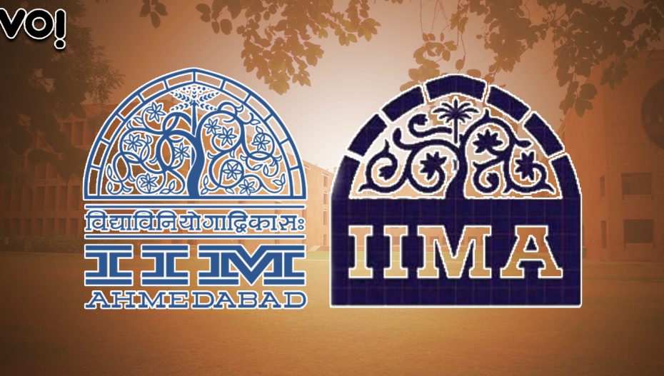
The IIMA logo change has sparked some lively debate, especially among the institute’s alumni. Vo! tapped into the views of IIMA’s batch of 1989, to find out their views on the issue:
Venkatesh Kini, former head of The Coca-Cola Company, India: In any logo design exercise, the most important criterion is visual impact and instant recognition of the brand name. The old logo used a very stylised font and included a lot of elements that competed with each other for attention. The colour was a very low contrast blue. The IIM letters constituted less than 20% of the real estate in the logo unit. In the digital environment, you need a higher contrast colour scheme that is compliant with accessibility standards so the bolder and deeper blue definitely pops up better. The original tree of life is a beautiful image but too intricate to reproduce well on small screens with low resolution. The new logo gives a close approximation to the original at first glance, which is as much time and attention that someone will give a logo. Elements like the Sanskrit phrase do not belong in a core logo unit, but can and should be added as a tagline in a bigger unit. If you look at most world class institutions, they have evolved their logos to be relevant in a digital-first environment, especially be compatible with small screens like the mobile phone. MIT, Yale and Harvard have modernised their logos over the years (see accompanying illustrations). Any rebranding will result in bouquets and brickbats, but I’m assuming that the designers got a brief similar to what I’ve outlined.
Atul Pande, chairman, Sportzlive: What Kini has said makes sense. On the point of the Islamic weaves being removed, my wife, who is attempting to specialise in Islamic Art these days, says that it’s our association which defines it as Islamic, else art is all syncretic. As for the location, is that relevant now, with education primarily being delivered through devices? Content and delivery really lead the show. Without commenting on the aesthetics of the new logo, I would say we should be supportive of change.
Rahul Bhasin, managing partner, Baring Private Equity: I’m a nostalgic nut who wants to see as little change as possible of my memories of IIMA. But I guess our time has passed and we must cede to the demands of modernity.
VM Kumar, management consultant: I think the objections to the new logo mostly stem from the fact that the process was not transparent and faculty members who are important stakeholders were not consulted. Design by committee is a bad idea. But reaching common understanding of need for change and new objectives is essential for buy-in. I doubt if that was even attempted going by the letter written on behalf of the faculty members.